
- Your cart is empty Browse Shop
Logo Design Tips for a Memorable Brand Identity
Key takeaways
- A memorable logo favours simplicity: one clear idea reproduces cleanly from a favicon to a billboard.
- Colour carries real weight. One in two consumers say they have chosen one brand over another based on colour alone (Adobe, 2025).
- Design the logo for scale first. Test it at 16 pixels before you admire it at full size.
- The logo is one part of a brand system that includes type, colour, spacing and voice working together.
- Avoid trend-chasing, clip-art icons and clutter: they are the fastest ways to erode brand recognition.
A memorable logo does one thing well: it carries a single clear idea in a shape simple enough to recognise anywhere, from a browser tab to a shop sign. The most useful logo design tips are not about clever tricks but about restraint, scalability, and consistency across every place your brand appears.
This guide walks through what actually makes a mark stick: why simple beats complex, how to choose colour and type that fit your brand, how to design for every size, the mistakes that quietly damage recognition, and how a logo fits into the wider system that holds a brand together.
Why simplicity leads the best logo design tips
Simplicity wins because a simple logo survives the real world. Think of the marks you can draw from memory: a few of them are little more than a shape or a letterform. Detail that looks impressive on a designer's screen tends to collapse when the logo is shrunk to a favicon, printed in one colour, or stitched onto a cap.
A simple logo is easier to recognise, easier to reproduce, and cheaper to use across formats. When a mark relies on fine lines, gradients, and many elements, every one of those details becomes a point of failure at small sizes. Strip the idea back to its core and the logo gets stronger, not weaker.
Simplicity also buys longevity. A busy, highly decorated mark is tied to the visual fashion of the year it was made, so it ages fast. A clean, confident shape can run for a decade or more with only minor refinements. For a small business, that saved rebranding cost is real money.
A practical rule: if you cannot sketch the logo from memory after looking at it for ten seconds, it is probably too complex. Reduce until the idea is unmistakable, then stop.
How do you choose colours and typography that reflect your brand?
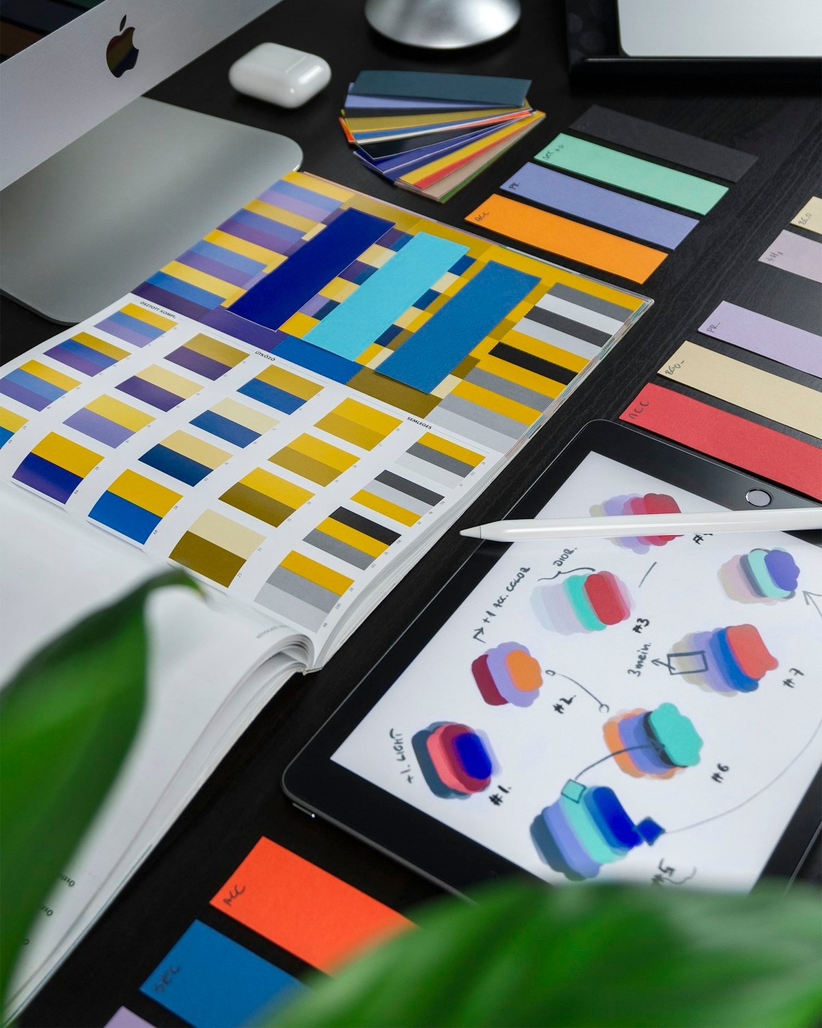
Colour and type do heavy lifting because people react to them before they read a single word. One in two consumers have chosen one brand over another based on colour alone, with Gen Z and millennials leading at 51%, according to Adobe's 2025 research on colour psychology in branding (Adobe, 2025). Your palette is not decoration; it is a first impression.
Start colour choices with meaning, not personal taste. In the same Adobe research, 54% of consumers named blue as the most trusted brand colour, which is why so many banks and tech firms reach for it. That does not mean you must use blue. It means you should choose a colour that supports the feeling you want, whether that is trust, energy, warmth, or calm.
Keep the palette tight. One or two core colours plus a neutral is enough for most brands, and you should always have a single-colour version ready for situations where colour is not an option. Too many colours make a logo harder to reproduce and harder to remember.
Typography deserves the same discipline. Pick type that matches your brand character: a geometric sans-serif reads as modern and clean, while a serif can feel established and trustworthy. Avoid novelty fonts that will look dated quickly. If your logo uses custom lettering, make sure it pairs with a practical typeface you can use for everything else, from your website to your invoices.
How do you design a logo that works at every scale?
Design for the smallest size first. A logo has to hold up as a 16-pixel favicon, a social media avatar, a business card, a van wrap, and a billboard, and the small end is where weak designs break. If the mark is still clear and recognisable at favicon size, it will almost certainly work larger.
Test early and often at the sizes you will actually use. Shrink the logo on screen, print it on plain paper, and look at it from across the room. Fine details, thin strokes, and text that sits inside the icon are the first things to disappear. Many strong identities solve this with a simplified icon-only version for tiny spaces and a full lockup for larger ones.
Build a small family of logo versions rather than a single file. A typical set includes the full logo, an icon-only mark, a horizontal lockup, a stacked version, and single-colour variants for light and dark backgrounds. Supplying these in vector formats, such as SVG and PDF, means the logo stays sharp at any scale instead of turning fuzzy when stretched. A web design partner like Uniclkay will usually expect this kind of flexible file set when building a site, so preparing it up front saves rework later.
Give the logo room to breathe. Define a minimum clear space around the mark and a minimum size below which it should never be used. These simple rules protect the logo from being crammed into tight layouts where it loses impact.
What common logo mistakes hurt brand recognition?
The most damaging mistakes come from trying too hard. Chasing the trend of the moment, overloading the mark with detail, and leaning on generic clip-art icons all push a logo toward looking like everyone else, which is the opposite of memorable.
Here are the mistakes that quietly erode recognition:
- Trend-chasing. Gradients, effects, and fashionable styles date quickly. A logo should outlast the trends around it.
- Too much detail. Complex illustrations and fine lines vanish at small sizes and print poorly.
- Generic icons. A stock lightbulb, globe, or swoosh signals "template" and makes your brand forgettable.
- Poor contrast. Light marks on light backgrounds, or clashing colours, hurt legibility and accessibility.
- Hard-to-read type. Overly decorative or tightly spaced lettering fails at a glance, which is exactly when people see most logos.
- Inconsistent use. Stretching, recolouring, or crowding the logo across different materials chips away at recognition over time.
Consistency is the thread running through all of these. A distinctive logo only becomes memorable when people see the same mark, in the same colours, used the same way, again and again. Every off-brand version resets that progress.
How does a logo fit into a wider brand system?
A logo is the signature, but the brand identity is the full handwriting. On its own, a logo is just one mark. It becomes powerful when it sits inside a consistent system of colour, typography, imagery, spacing, and tone that work together across your website, packaging, social media, and advertising.
That consistency pays off. Research on brand consistency has repeatedly linked a cohesive, uniformly applied identity to stronger revenue performance, which is why brand guidelines exist in the first place. When every touchpoint looks and sounds like the same company, trust builds faster and recognition compounds.
Document the rules in a short brand guide. Capture the logo variations, the colour values, the fonts, the clear-space rules, and a few do-and-don't examples. This is what keeps your identity consistent when different people, agencies, or printers handle your materials. Strong branding also feeds directly into how your site ranks and converts, which is why branding, web design, and search visibility are best planned together rather than in isolation.
Think of the logo as the entry point, not the whole job. A well-designed mark earns attention; a well-built system turns that attention into a brand people remember and choose.
Putting it into practice
Pick one small test this week: shrink your current logo to favicon size and view it on your phone. If it holds up clearly in one colour at that size, you have a solid foundation to build the rest of your identity around. If it does not, that is your starting point for a refresh. When you are ready to turn a strong logo into a full identity and website, work with a team that treats branding and web design as one connected system, such as Uniclkay's digital agency services, so every touchpoint reinforces the same memorable brand.
Frequently asked questions
What makes a logo memorable?
A single clear idea, a simple shape that reads at any size, a distinctive colour, and consistent use across every touchpoint. Memorability comes from repetition of a simple mark, not from packing in detail.
How many colours should a logo use?
One or two is a safe target, with a single-colour version always on hand. Fewer colours reproduce better in print, on screen and in tricky situations like embroidery or a one-colour stamp.
Does logo colour really affect how people see a brand?
Yes. One in two consumers say they have chosen one brand over another based on colour alone, and 54% name blue as the most trusted brand colour (Adobe, 2025). Colour shapes first impressions quickly.
What is the difference between a logo and a brand identity?
A logo is a single mark. A brand identity is the full system around it: colour palette, typography, imagery, spacing rules and tone of voice. The logo is the signature; the identity is the handwriting.
Should a small business hire a designer or use a template?
Templates work for a quick start, but a custom logo built with a clear brief avoids generic clip-art looks and scales properly. A designer also delivers the file formats and variations you need for real-world use.